ICOMETRIX
Rebranding icometrix — A healthcare company leveraging imaging AI to support radiologists and improve patient care.
Skills
Client
Link
Date
The icometrix rebranding was guided by one goal: to create a cohesive identity that supports radiologists while emphasizing the company’s commitment to improving patient care. The previous branding lacked consistency, clarity, and a sense of trustworthiness, which were crucial to the company’s mission.
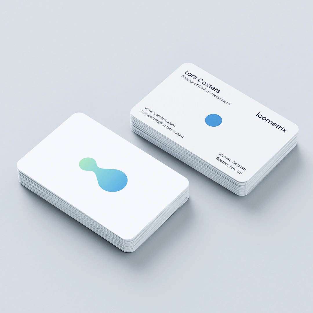
To address this, the design language was built around circles and pill forms, symbolizing focus, connection, and growth.
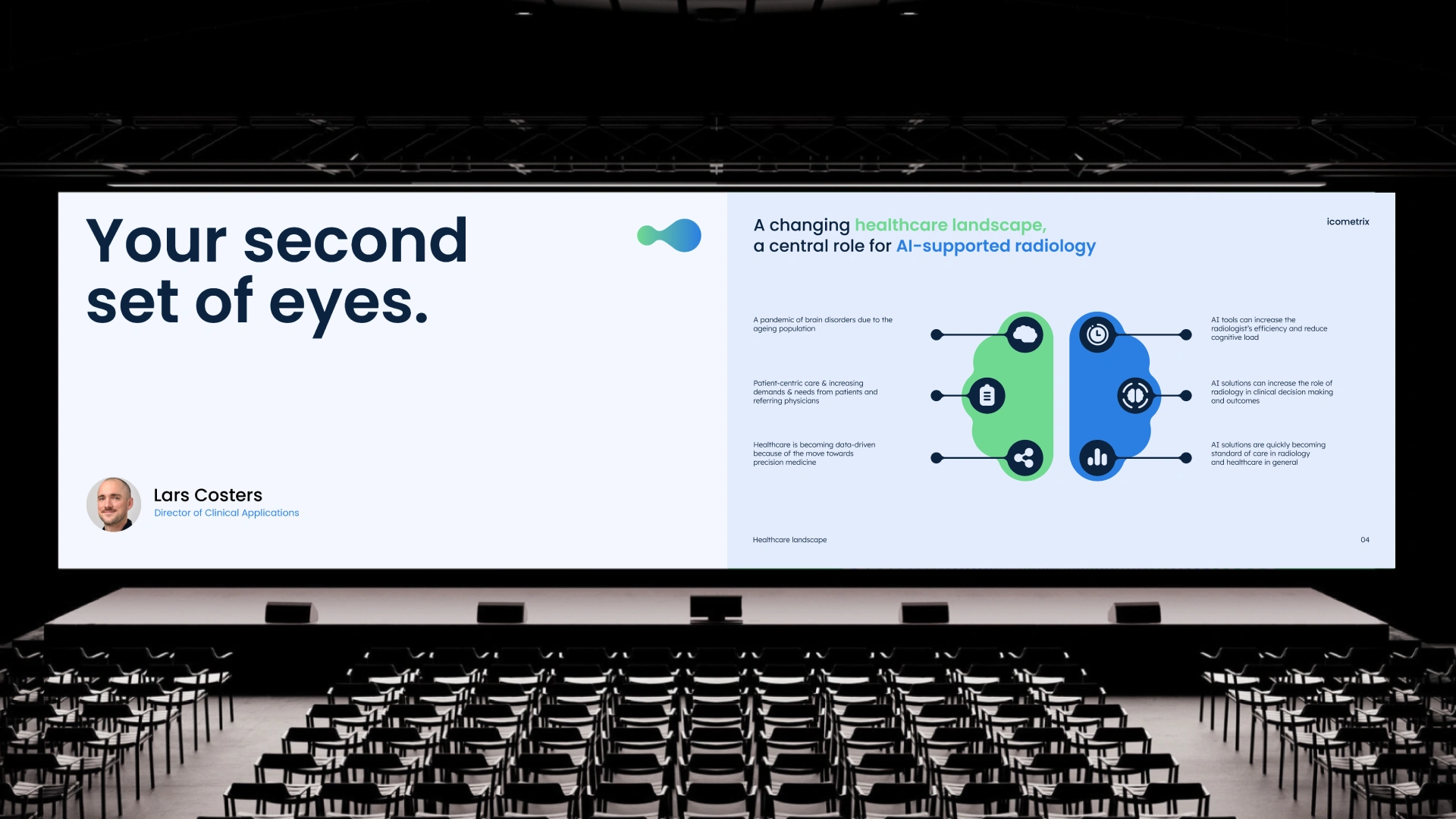
A new color palette and motion language were introduced to reinforce clarity and calm. Transitions from blurred to sharp visuals represent clarity in chaos, while a smooth, decelerating keyframe curve underscores peace of mind. This approach mirrors icometrix’s mission to simplify complex imaging data and support radiologists under immense pressure.
This rebranding brings the icometrix identity to life as a trusted second set of eyes for radiologists.